

What Is Visual Hierarchy in Design?
Visual hierarchy in design is the deliberate arrangement of elements so the viewer instantly understands what to look at first, second, and third. It is the silent guide that takes the eye on a journey across a page, screen, poster or interface, ranking content by importance through visual cues rather than words.
Without a clear hierarchy, every element competes for attention at the same volume. The result is noise. With a strong hierarchy, even a busy layout feels calm, scannable and intuitive.

Why Visual Hierarchy Is the Foundation of Good Design
Whether you are designing a landing page, an annual report, a mobile app or a billboard, hierarchy decides whether your message lands or gets ignored. Here is why it matters:
- It reduces cognitive load. Users do not have to think about where to look, they simply follow the path you built.
- It increases conversion. Clear primary actions get clicked more often than buried ones.
- It improves accessibility. Strong contrast and structure help users with visual impairments or cognitive differences.
- It communicates brand maturity. Well-ordered design simply looks more professional.
The 5 Core Tools to Build Visual Hierarchy
You do not need fancy effects to establish hierarchy. Five fundamental tools do almost all the work.
1. Size and Scale
Bigger elements are seen first. This is the simplest and most reliable lever. A headline at 64 px will always beat a paragraph at 16 px for attention.
- Hero titles, key statistics and primary call-to-action buttons deserve the largest sizes.
- Secondary content should step down clearly, not by 1 or 2 pixels, but by meaningful jumps.
2. Color
The eye is drawn to warm, saturated and unusual colors before muted ones. Use a single accent color for the most important action and keep the rest of the palette restrained.
3. Contrast
Contrast is not only about color. It can be light versus dark, bold versus thin, full versus empty, organic versus geometric. The greater the contrast, the higher in the hierarchy an element sits.
4. Spacing and White Space
Generous space around an element acts like a spotlight. Crowding things together flattens hierarchy. Group related items, separate unrelated ones, and let your most important content breathe.
5. Typography
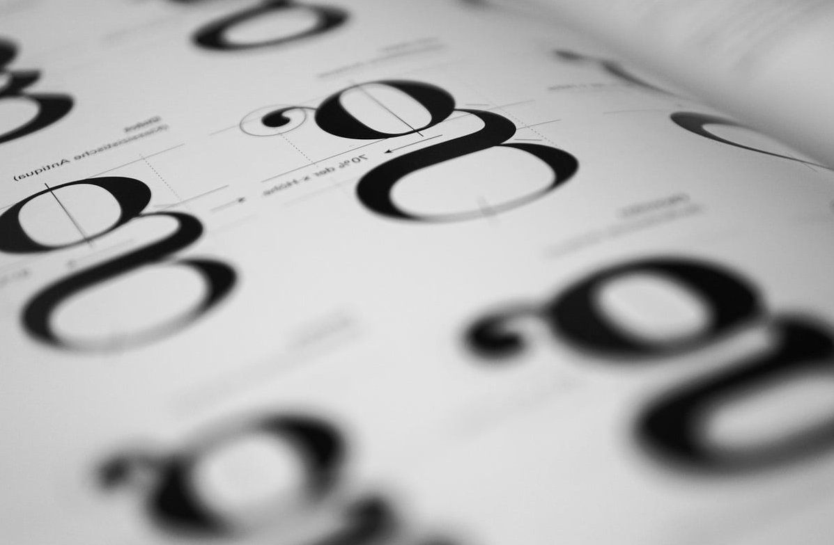
A proper type scale is one of the fastest ways to upgrade any layout. Define three to five clear levels (display, H1, H2, body, caption) and stick to them across the project. Mixing weights (Regular, Semibold, Bold) adds a second axis of hierarchy without adding more sizes.
Quick Reference Table: Tool, Effect, Best Use
| Tool | Effect on the Eye | Best Used For |
|---|---|---|
| Size | Immediate attention | Headlines, hero CTAs |
| Color | Emotional pull and focus | Buttons, alerts, key data |
| Contrast | Separation from surroundings | Key text, focal images |
| Spacing | Grouping and isolation | Sections, cards, forms |
| Typography | Structural rhythm | Articles, dashboards, print |
How Users Actually Read: F and Z Patterns
Eye-tracking research shows two dominant scanning patterns you can design around:
- F-Pattern: Common on text-heavy pages like blogs and search results. Place key info on the top and along the left edge.
- Z-Pattern: Common on visual, sparse layouts like landing pages. The eye sweeps top-left to top-right, then diagonally to bottom-left, then across to bottom-right. Put your logo, primary message, and CTA on these anchor points.
Applying Visual Hierarchy in Web Design
On the web, hierarchy directly affects bounce rate and conversion. A practical checklist:
- One dominant headline above the fold. No competing H1s.
- One primary CTA per view. Secondary actions stay visually quieter (outline or text links).
- Use cards and dividers to group content, never just rely on alignment.
- Maintain a minimum 4.5:1 contrast ratio for body text (WCAG AA).
- Limit your type scale to a maximum of 5 sizes per page.
Applying Visual Hierarchy in Print Design
Print does not have hover states or scroll. Hierarchy must do all the work at first glance.
- Posters: A single bold focal point (image or word) carries the design. Everything else supports it.
- Magazines and brochures: Use pull quotes, drop caps and large opening images to anchor each spread.
- Packaging: Brand mark, product name, and key benefit must form a clear 1-2-3 reading order from across a shelf.
Common Mistakes That Break Hierarchy
- Making too many things “important”. If everything shouts, nothing is heard.
- Using more than two accent colors, which dilutes focus.
- Tiny size differences between heading levels (18 px vs 20 px is invisible).
- Centered text everywhere, which weakens the F and Z reading patterns.
- Ignoring white space to fit more content. Density is not the same as value.

A Simple Workflow to Audit Your Design
- Squint test: Blur your design or squint at it. The first 1 to 3 elements you still see should be the most important ones.
- Grayscale test: Remove color. If hierarchy still works, your structure is solid. If it collapses, you are leaning too hard on color.
- 5-second test: Show the design to someone for 5 seconds, then ask what they remember. Their answer reveals your real hierarchy.
Key Takeaways
- Visual hierarchy is not decoration, it is communication structure.
- Size, color, contrast, spacing and typography are the five core levers.
- Start by deciding what is most important, then make sure nothing else competes with it.
- Test your work with squint, grayscale and 5-second tests before shipping.
FAQ
What are the main principles of visual hierarchy?
The most widely used principles are size, color, contrast, spacing, typography, alignment, proximity and repetition. Together they let designers rank elements by importance.
What is a simple example of visual hierarchy?
A newspaper front page: the masthead is largest, the main headline is bold and big, sub-headlines are medium, and body text is small. You instantly know what to read first.
How do I create visual hierarchy as a non-designer?
Pick one element to be the hero and make it clearly bigger, bolder or more colorful than anything else. Then group related items with spacing and keep typography to three sizes. That alone solves most layout problems.
Does visual hierarchy apply to UX and UI design?
Yes, it is essential. In UI, hierarchy decides which button users click, which information they trust, and how easily they complete tasks. Poor hierarchy is one of the top causes of usability issues.
What is the difference between visual hierarchy and layout?
Layout is the arrangement of elements in space. Visual hierarchy is the ranking of those elements by importance. A good layout supports hierarchy, but you can have a tidy layout with no hierarchy at all.