A great restaurant menu design is more than a list of dishes with prices. It is a sales tool, a brand statement and a navigation system rolled into one. And in 2026, it needs to perform in two very different environments: a printed piece your guests hold at the table, and a digital page they scroll on a phone before booking. Designing for only one of these contexts is a missed opportunity.
In this guide, we walk through how to design a menu that looks sharp in print and loads fast and reads well on the web, with concrete tips on typography, grids, photography, readability and file preparation.
Why Print and Web Menus Need Different Thinking
Printed menus and web menus share the same content, but the user behavior is completely different. A printed menu is read in a few minutes, often under warm lighting, while a customer is hungry. A web menu is scanned in seconds, on a small screen, often before the customer has decided to visit.
That means you can’t just export a PDF of your print menu and call it a website. You need a strategy that keeps the brand consistent across both formats while adapting layout, hierarchy and image weight to each medium.
| Element | Print Menu | Web Menu |
|---|---|---|
| Resolution | 300 DPI, CMYK | 72 DPI, RGB, sRGB profile |
| Typography size | 10 to 12 pt body | 16 to 18 px body |
| Layout | Fixed grid, multi-column | Responsive, single column on mobile |
| Photography | Optional, often minimal | Encouraged, drives conversion |
| File format | PDF/X-1a with bleed | HTML page + WebP images |
Step 1: Start With Structure, Not Decoration
Before opening any design tool, map out the menu architecture. A well-structured menu is easier to scan, easier to update and easier to translate into a web version.
- Group dishes by category (starters, mains, desserts, drinks).
- Limit choices per category to 5 to 7 items to reduce decision fatigue.
- Identify your hero dishes, the 2 or 3 items with the best margin or strongest brand story.
- Decide on modifiers and allergens early so they fit cleanly in the layout.
Step 2: Typography That Works on Paper and Screens
Typography is the single most impactful choice in restaurant menu design. The wrong font kills readability under low light or on a phone screen.
Choose two typefaces, not five
- One display font for the restaurant name, section titles and hero dishes.
- One text font for dish names, descriptions and prices.
Recommended pairings for 2026
- Playfair Display + Inter (classic and refined)
- Fraunces + Manrope (warm and modern)
- Cormorant + Source Sans 3 (elegant fine dining)
- Archivo + IBM Plex Serif (contemporary casual)
Readability rules to respect
- Body text should never go below 10 pt in print or 16 px on web.
- Line height should be 1.4 to 1.6 times the font size.
- Avoid all-caps for descriptions, it slows reading by up to 15%.
- Use a maximum of 2 weights per typeface to keep hierarchy clean.

Step 3: Build a Grid That Translates Across Formats
A grid is the invisible skeleton of your menu. For print, a 12-column grid gives you flexibility for single, double or triple-column layouts. For web, the same 12-column grid maps perfectly to CSS frameworks and collapses cleanly on mobile.
Tips for a flexible grid
- Use the same baseline grid across print and web so vertical rhythm feels consistent.
- Keep margins generous, at least 15 mm in print and 24 px on mobile.
- Align prices to a fixed column, not after dotted leaders, for a cleaner modern look.
- Reserve a clear visual zone for hero dishes, like a tinted box or larger typography.
Step 4: Using Photography the Right Way
Photography is where print and web menus diverge the most. In print, too many photos make a menu look like a fast food chain. On the web, photos boost conversions because customers want to see what they will eat.
For print
- Use 1 or 2 hero images max, full bleed, with high contrast.
- Keep image color profiles in CMYK and soft-proof before printing.
- Consider illustrations or food sketches as a brand-friendly alternative.
For web
- Add a photo to every hero dish and to category headers.
- Export images in WebP or AVIF format for fast loading.
- Target under 150 KB per image and use lazy loading.
- Always include descriptive alt text for SEO and accessibility.
Step 5: Readability and Accessibility
An unreadable menu is a lost sale. Accessibility is no longer optional, especially on the web where WCAG 2.2 compliance is becoming a baseline expectation.
- Maintain a contrast ratio of at least 4.5:1 between text and background.
- Avoid placing text over busy photos without a tint or overlay.
- Mark allergens with both color and an icon, never color alone.
- Make your web menu navigable by keyboard and screen reader.
- Offer a downloadable PDF version for guests who prefer it.
Step 6: File Preparation for Print
This is where many designs fall apart. A beautiful menu poorly exported becomes a printer’s nightmare.
- Work in CMYK from the start, not RGB.
- Set a 3 mm bleed on all sides and a 5 mm safety margin inside.
- Embed or outline all fonts before exporting.
- Export as PDF/X-1a or PDF/X-4 for press-ready output.
- Confirm paper choice with your printer, coated stock for vivid photos, uncoated for a more artisanal feel.
Step 7: File Preparation for Web
For the digital version, think performance, SEO and ease of update.
- Build the menu as real HTML text, not as an embedded image or PDF. Google needs to read it.
- Use semantic markup with headings (h2 for categories, h3 for dishes).
- Add Schema.org Menu structured data so search engines can display rich results.
- Compress images and serve them in next-gen formats.
- Make the page mobile-first, since most menu views happen on phones.
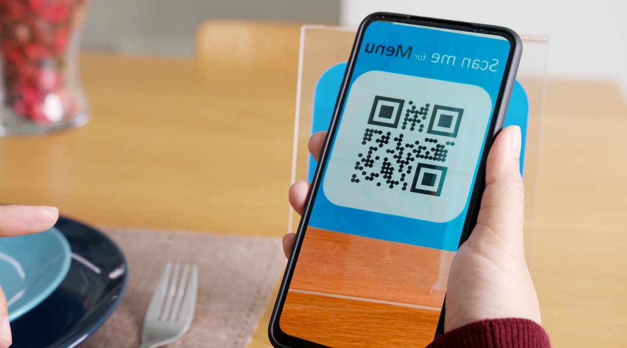
- Offer a QR code on the printed menu that links to the web version for instant updates.
Common Mistakes to Avoid
- Using the same PDF as both the print and web menu.
- Overloading the page with too many fonts or photos.
- Forgetting bleed or safety margins in print files.
- Hiding prices or using dollar signs that scare customers (studies show removing the currency symbol can increase spend).
- Not updating the digital menu when the print one changes.
Bringing It All Together
A successful restaurant menu design in 2026 is a system, not a single artifact. The print menu sets the mood at the table, the web menu drives the booking. When both share the same typography, grid, tone of voice and photography style, your brand feels coherent and your guests feel confident before they even sit down.
At J-A-B, we help restaurants and hospitality brands build menu systems that perform across every touchpoint, from the printed card to the responsive website. If you’re rethinking your menu this year, start with structure, design for both formats from day one, and treat your menu as the powerful marketing asset it really is.
FAQ: Restaurant Menu Design
What is the 30/30/30 rule for restaurants?
The 30/30/30 rule suggests keeping roughly 30% of the menu as classics, 30% as signature high-margin dishes, and 30% as seasonal or rotating items, with the remaining 10% for specials. It helps balance familiarity, profitability and novelty.
Can I use AI to create a restaurant menu?
Yes, AI tools can help generate dish descriptions, suggest layouts and even produce mockups. However, final design decisions around brand identity, typography pairing and print preparation still benefit from a human designer’s eye.
Should I put photos on my menu?
On the web, yes, especially for hero dishes. In print, use photography sparingly. Heavy use of photos in print menus can lower perceived quality in mid to high-end restaurants.
What is the best file format for a printed menu?
PDF/X-1a or PDF/X-4 with embedded fonts, CMYK color profile, 3 mm bleed and 300 DPI images is the safest choice for any professional printer.
How often should I redesign my menu?
A full redesign every 2 to 3 years keeps your brand fresh. Content updates (prices, seasonal dishes) should happen more often, which is why a flexible digital version is essential.