
Why Every Branding Project Starts with a Mood Board
Before a single logo concept is sketched or a color palette is finalized, the most important step in any branding project is aligning on visual direction. That is exactly what a mood board does. It bridges the gap between abstract ideas and tangible design decisions, giving both designers and clients a shared visual language to work from.
Whether you are a designer, a brand strategist, or a business owner about to rebrand, knowing how to create a mood board is an essential skill. In this guide, we walk through the full process, from gathering raw inspiration to organizing it into a polished presentation that drives confident brand identity decisions.
What Is a Mood Board (and What It Is Not)
A mood board is a curated collection of visual references that communicates the look, feel, and emotional tone of a project. It typically includes images, color swatches, typography samples, textures, patterns, and sometimes short text snippets or keywords.
What a mood board is not:
- A Pinterest board with 200 random pins
- A finished design or layout
- A style guide or brand guidelines document
Think of it as a compass, not a map. It points everyone in the right direction without dictating every turn.
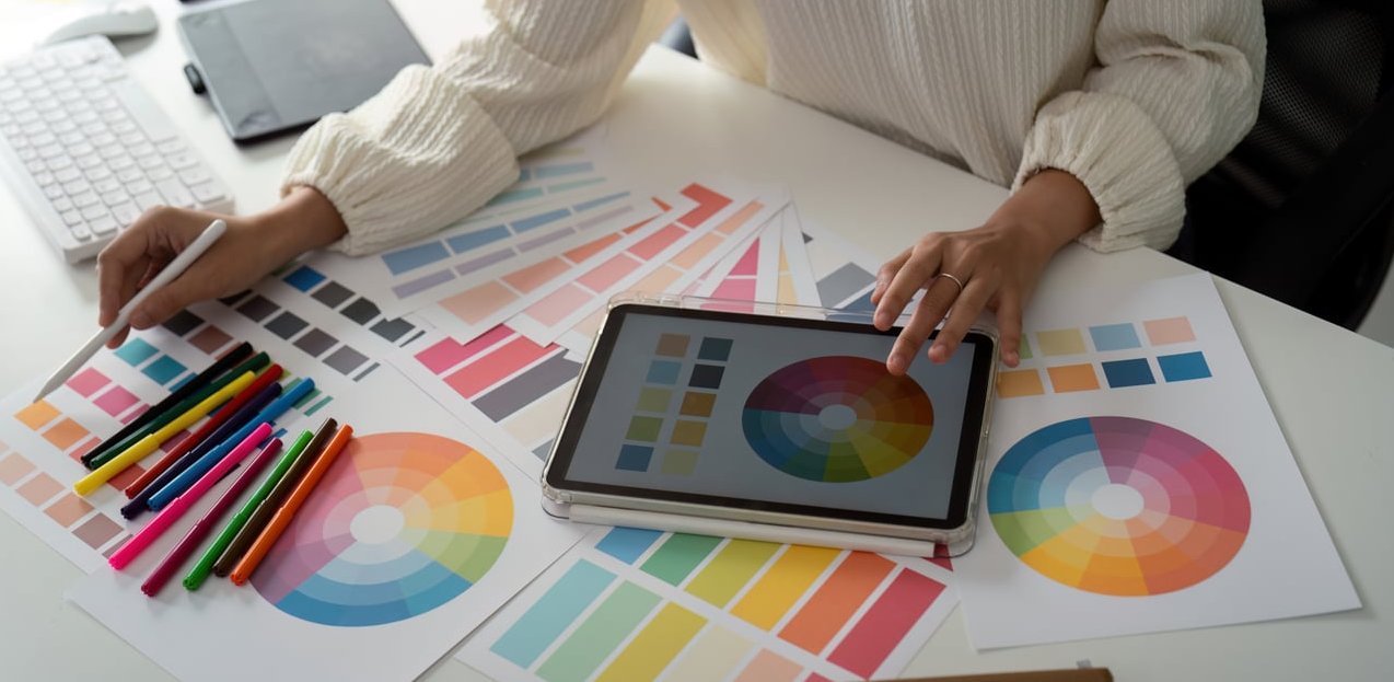
The 3 Main Components of a Mood Board
Every effective mood board, whether digital or physical, is built on three pillars:
| Component | What It Includes | Why It Matters |
|---|---|---|
| Imagery | Photography, illustrations, textures, patterns | Sets the overall visual tone and emotional resonance |
| Color | Color swatches, gradients, dominant hues from images | Establishes the palette direction for the brand |
| Typography & Texture | Font samples, material references, graphic styles | Communicates personality, whether bold, refined, playful, etc. |
Some mood boards also include a fourth layer: keywords or short phrases that anchor the visual references with verbal context. Words like “earthy,” “premium,” or “approachable” can clarify intent when visuals alone leave room for interpretation.
5 Elements You Should Include on a Branding Mood Board
If you want your mood board to be truly useful for brand identity decisions, aim to include these five elements:
- Brand photography references – The style of photography that reflects the brand world (lifestyle, product, editorial)
- Color palette direction – At least 3 to 5 colors extracted from or inspired by your collected images
- Typography inspiration – Font pairings or lettering styles that match the brand personality
- Texture and material references – Paper stocks, fabric, surfaces, or digital textures that evoke the right tactile feeling
- Existing brand or design references – Examples from other brands, packaging, or environments that capture a similar energy

How to Create a Mood Board: Step-by-Step Process
Here is the exact process we use at J-A-B when creating mood boards for client branding projects.
Step 1: Define the Project Brief and Brand Attributes
Before opening any tool, you need clarity on what the brand should feel like. Start by answering these questions:
- Who is the target audience?
- What are 3 to 5 adjectives that describe the desired brand personality?
- What should the brand absolutely not look or feel like?
- Are there competitor brands to differentiate from?
Write these down. They become your filter for every image you collect in the next step.
Step 2: Gather Raw Visual Inspiration
Now it is time to cast a wide net. Collect far more images than you will ultimately use. Here are the best places to look:
- Pinterest – Excellent for broad visual exploration across categories
- Behance and Dribbble – Great for design-specific references and branding case studies
- Instagram – Useful for photography styles, lifestyle imagery, and real-world brand aesthetics
- Unsplash and Pexels – High-quality stock photography for texture and mood references
- Physical sources – Magazines, fabric swatches, printed materials, packaging
Pro tip: Aim to collect 30 to 50 images in this phase. You will curate ruthlessly in the next step.
Step 3: Curate and Edit Down
This is where the real skill lives. Go through your collection and ask for each image: Does this support the brand attributes we defined in Step 1?
Remove anything that:
- Feels redundant (two images saying the same thing)
- Contradicts the desired tone
- Was saved only because it looked “cool” without serving the brief
Aim to narrow your selection down to 10 to 15 images for a single mood board. If you are presenting multiple directions to a client, create 2 to 3 separate boards with 8 to 12 images each.
Step 4: Arrange and Compose the Board
Layout matters more than most people think. A mood board is not just a grid of images. The composition itself communicates hierarchy and energy.
Consider these layout principles:
- Give the most important or representative image the largest space
- Use white space intentionally to let the board breathe
- Group related elements (e.g., color swatches near the images they were pulled from)
- Add typography samples and keywords as anchoring elements
You can use a freeform layout for a more organic feel, or a structured grid for a clean, controlled presentation.
Step 5: Add Context and Present to the Client
A mood board without context is just a collage. When presenting to a client, always include:
- A brief written summary (2 to 3 sentences) explaining the direction
- The brand attributes this board represents
- Notes on how specific elements translate to brand decisions (e.g., “The muted earth tones suggest a warm, grounded palette for the brand”)
This turns the mood board from a passive visual into an active strategic tool.
Digital vs. Physical Mood Boards
Both formats have their place. Here is a quick comparison to help you decide:
| Factor | Digital Mood Board | Physical Mood Board |
|---|---|---|
| Best for | Remote teams, client presentations, fast iteration | Workshops, tactile brands, packaging projects |
| Speed | Fast to assemble and revise | Slower but more immersive |
| Collaboration | Easy to share and comment on remotely | Best experienced in person |
| Tactile quality | Limited to screen | Can include fabric, paper, and real materials |
| Cost | Free to low cost | Printing and material costs |
For most branding projects in 2026, a digital mood board is the practical default. But if you are working on a luxury brand, a product with strong material identity, or running an in-person brand workshop, a physical mood board can make a powerful impression.
Best Tools to Create a Mood Board
The right tool depends on your workflow, your team, and how you plan to present. Here are our top recommendations:
Milanote
Best for: Designers and creative teams working on branding projects.
Milanote is purpose-built for visual thinking. Its freeform canvas lets you drag and drop images, color swatches, notes, and links into flexible layouts. It feels like a digital version of pinning things to a wall, which is exactly what mood boarding should feel like. The collaboration features make it easy to share boards with clients and collect feedback in one place.
Best for: Early-stage inspiration gathering.
Pinterest remains unmatched for discovering visual inspiration. Its algorithm surfaces related content quickly, making it ideal for the brainstorming phase. However, a Pinterest board on its own is not a finished mood board. Use it for collection, then move your curated selections into a more controlled layout tool.
Canva
Best for: Non-designers or quick internal presentations.
Canva offers mood board templates that make it easy to drop in images and create a polished layout without design skills. It is a solid option if you need something fast, though it can feel limiting for complex or nuanced branding work.
Figma / FigJam
Best for: Design teams already using Figma for their workflow.
If your branding project lives in Figma, it makes sense to build your mood boards there too. FigJam offers a more casual, whiteboard-style canvas, while Figma itself gives you precise layout control. Both support real-time collaboration.
Adobe Firefly Boards
Best for: Teams in the Adobe ecosystem looking for AI-assisted inspiration.
Adobe’s Firefly Boards let you combine collected references with AI-generated imagery for rapid concept exploration. It is a newer tool worth exploring in 2026, especially for teams that already rely on Creative Cloud.
Quick Tool Comparison
| Tool | Free Plan | Collaboration | Best Phase |
|---|---|---|---|
| Milanote | Yes (limited) | Yes | Curation and presentation |
| Yes | Limited | Inspiration gathering | |
| Canva | Yes | Yes | Quick assembly |
| Figma / FigJam | Yes (limited) | Yes | Design team workflow |
| Adobe Firefly Boards | With CC subscription | Yes | AI-assisted exploration |
How to Use a Mood Board to Guide Brand Identity Decisions
A mood board is only as valuable as the decisions it helps you make. Here is how to translate a mood board into actionable brand identity work:
Color Palette
Extract dominant and accent colors directly from your mood board images. Tools like Coolors or Adobe Color can pull palettes from uploaded images. The mood board ensures the palette feels right in context, not just in isolation.
Typography Direction
The mood board reveals whether the brand calls for a serif or sans-serif, bold or lightweight, geometric or humanist typeface. If your board is full of clean minimalist imagery, a decorative script font would feel out of place, and the board makes that obvious at a glance.
Photography and Illustration Style
The mood board becomes a direct reference for photographers, illustrators, and content creators. It answers questions like: Should brand photos feel candid or composed? Bright and airy or dark and moody? Lifestyle-driven or product-focused?
Logo and Graphic Direction
While a mood board does not design the logo, it establishes the visual territory the logo should live in. It informs whether the brand mark should be minimal or detailed, abstract or literal, classic or contemporary.
Overall Brand Personality
Perhaps most importantly, the mood board aligns the entire team on the brand’s personality before detailed design work begins. It prevents the costly back-and-forth that happens when stakeholders have different visions in their heads.
Mood Board Examples for Branding Projects
To make this more concrete, here are three common branding scenarios and what their mood boards might emphasize:
Example 1: Premium Skincare Brand
- Soft, muted color palette (blush, cream, sage)
- Close-up textures of natural ingredients and botanical elements
- Elegant serif typography samples
- Minimalist packaging references with tactile material callouts
- Keywords: refined, clean, sensorial, luxurious
Example 2: Tech Startup Targeting Gen Z
- Bold, saturated gradients and neon accents
- Dynamic photography with movement and energy
- Rounded, friendly sans-serif type
- UI references and app interface aesthetics
- Keywords: bold, playful, fast, inclusive
Example 3: Artisan Coffee Roaster
- Warm earth tones (terracotta, deep brown, olive)
- Hand-crafted textures, kraft paper, letterpress printing
- Vintage-inspired typefaces mixed with modern sans-serifs
- Rustic cafe interiors and close-up bean imagery
- Keywords: authentic, handcrafted, warm, origin-focused
Common Mood Board Mistakes to Avoid
Even experienced designers sometimes fall into these traps:
- Including too many images. More is not better. A cluttered board dilutes the message. Stick to 10 to 15 carefully chosen visuals.
- Mixing conflicting directions on one board. If you want to present multiple options, create separate boards, one per direction.
- Skipping the brief. Collecting images without clear brand attributes leads to a pretty but purposeless board.
- Using it as decoration. A mood board is a working tool, not wall art. It should drive real decisions.
- Not presenting it with context. Never email a mood board without explanation. Walk the client through it verbally or include written notes.
Frequently Asked Questions
How do you create your own mood board?
Start by defining the purpose and personality of your project. Then collect visual inspiration from sources like Pinterest, Behance, and magazines. Curate your selection down to 10 to 15 strong images, arrange them in a layout tool like Milanote or Canva, and add color swatches, typography samples, and keywords. Finally, present the board with a brief written explanation of the direction.
What are the three main components of a mood board?
The three core components are imagery (photographs, illustrations, textures), color (swatches and palette direction), and typography and texture (font styles, material references, graphic treatments). Together, these elements communicate the visual tone of a project.
What is the best program to create a mood board?
It depends on your needs. Milanote is ideal for creative professionals working on branding. Canva is great for quick, template-based boards. Figma works well for design teams. Pinterest is best for the initial inspiration gathering phase rather than final presentation.
What 5 elements should you include on a mood board?
For a branding mood board, include: (1) brand photography references, (2) color palette direction, (3) typography inspiration, (4) texture and material references, and (5) existing brand or design references that capture a similar energy to your desired outcome.
How to create a mood board on Pinterest?
Create a new secret board on Pinterest and start pinning images that align with your project brief. Use specific search terms related to your brand attributes. Once you have collected enough pins, review and remove anything off-brief. Keep in mind that a Pinterest board works best as a collection tool. For client presentations, transfer your best selections into a layout tool for a more polished result.
Can you create a physical mood board for a branding project?
Absolutely. Print your curated images, cut fabric or material swatches, and pin or glue everything to a foam board or large card. Physical mood boards are especially effective for brands with strong tactile identities, like packaging-heavy products, luxury goods, or interior-focused businesses. They work best when presented in person during workshops or strategy sessions.
How many mood boards should you present to a client?
We typically recommend presenting 2 to 3 distinct directions. This gives the client meaningful choice without overwhelming them. Each board should represent a clearly different visual direction so the conversation stays productive and focused.