
Your About page is often the second most visited page on your website, right after the homepage. Yet most companies treat it as an afterthought, filling it with corporate jargon and stock photos that build zero trust. A well-crafted about page design can transform curious visitors into loyal customers by telling a story, showcasing real people, and proving credibility at every scroll.
In this guide, we break down the exact structure, copy patterns, and visual examples that make an About page work. No fluff, just a practical walkthrough you can apply to your own website today.
Why About Page Design Matters More Than You Think
Before a prospect fills out a contact form or clicks “Buy Now,” they want to know one thing: who is behind this business? Your About page answers that question. It is where skepticism goes to die, or thrive.
A strong About page:
- Builds emotional connection through storytelling
- Establishes authority with real faces, credentials, and results
- Reduces buyer anxiety by showing transparency
- Increases conversion rates on other pages of your site
- Improves SEO by targeting brand-related and trust-related searches
According to multiple UX studies, visitors decide whether to trust a website within the first 5 to 7 seconds. Your About page needs to deliver instant credibility while inviting deeper exploration.
The 6 Essential Sections of a High-Converting About Page
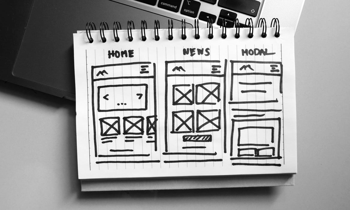
Here is the anatomy of an About page that actually converts. You do not need every section, but the strongest pages include most of them.
1. The Hook: A Clear Value Statement
Open with one sentence that tells visitors what you do and who you serve. Skip the “Welcome to our company” opener. Instead, lead with clarity.
Weak: “Welcome to Acme Corp, a leading provider of solutions.”
Strong: “We help independent bakeries double their online orders in 90 days.”
2. The Origin Story
Humans are wired for narrative. Share the honest reason your company exists. What problem frustrated the founder? What moment sparked the idea?
Keep it under 200 words. Use first-person voice when possible. Add a photo of the founder or the early days of the business to anchor the story visually.
3. Mission, Vision, and Values
This is where most companies write generic filler. Do not. Values should be specific enough that a competitor could not copy them.
Layout tip: use a three-column or card-based grid with icons and short descriptions. Each value should include a one-line explanation of how it shows up in your work.
4. The Team
People buy from people. Show real photos, not stock images. Include:
- Full name and role
- A short bio (2 to 3 sentences)
- A personality-driven detail (favorite book, hobby, fun fact)
- LinkedIn link for credibility
Small teams should show everyone. Larger companies can highlight leadership plus a group photo of the full staff.
5. Social Proof
Trust signals are the single biggest conversion lever on an About page. Layer several types:
| Type of Proof | Example | Best Placement |
|---|---|---|
| Client logos | Grid of 6 to 12 recognizable brands | Below the hero section |
| Testimonials | Quote with photo and job title | After the story section |
| Numbers | Years in business, clients served, projects delivered | Mid-page stat bar |
| Press mentions | “As seen in” logo strip | Near the top or footer |
| Certifications | Industry awards, ISO badges | Alongside team section |
6. A Clear Call to Action
Do not let visitors hit a dead end. End the page with a specific next step: book a call, browse services, download a resource, or send a message. One primary CTA works better than three competing ones.

Design Principles That Make an About Page Feel Trustworthy
Structure is half the battle. Visual execution is the other half. Follow these design rules:
- Use real photography. Stock images kill credibility instantly. Invest in a photo session or use candid team shots.
- Give content room to breathe. Generous white space signals confidence and quality.
- Break up text with visuals. Alternate between text blocks, images, and data callouts every 2 to 3 scrolls.
- Keep typography readable. Body text should be at least 16px, with clear heading hierarchy.
- Add micro-interactions. Subtle hover effects, scroll animations, or a video background can make the page feel modern without becoming distracting.
- Design mobile-first. Over 60% of About page visits happen on mobile devices. Test every section on a phone.
Real About Page Examples Worth Studying
Rather than list generic “best of” websites, here are the types of About pages worth analyzing and what makes each work:
The Story-Driven Page (used by Basecamp, Patagonia)
These pages read like an essay. Long-form narrative, strong opinions, minimal design distractions. Best for brands with a mission-driven audience.
The Data-Heavy Page (used by Stripe, HubSpot)
Big numbers, clear metrics, global reach. This format builds trust through scale. Best for B2B SaaS and enterprise services.
The Team-First Page (used by design agencies and boutique consultancies)
Faces dominate the layout. Bios are personal and warm. Best for service businesses where the people are the product.
The Interactive Page (used by creative studios on Awwwards)
Scroll-triggered animations, video reels, playful cursors. Impressive but risky. Only use this if your audience expects design flair.
Copywriting Tips That Elevate Your About Page
- Write like you speak. Read every sentence aloud. If it sounds unnatural, rewrite it.
- Focus on the reader. For every “we,” balance with a “you.” Explain what your background means for the visitor.
- Cut the buzzwords. Words like “synergy,” “innovative solutions,” and “world-class” mean nothing. Be specific.
- Show, do not tell. Instead of “We are passionate about quality,” describe a moment that proves it.
- Use short paragraphs. Two to three sentences maximum. Web readers scan before they read.

Common About Page Mistakes to Avoid
- Using “About Us” as the only navigation label (try “Our Story” or “Who We Are” for personality)
- Hiding the team behind vague corporate speak
- Overloading the page with a full company history nobody wants to read
- Forgetting to update stats, team members, or client logos
- Ending the page with no clear next action
FAQ: About Page Design
How long should an About page be?
Aim for 400 to 1,000 words for most businesses. Long enough to build trust, short enough to keep attention. Break the copy into scannable sections with visuals.
Should I use “About Us” or “About Me”?
Use “About Me” for solo entrepreneurs and freelancers, “About Us” for teams. If your brand is a personal brand with a small team, you can mix both voices.
Do I need a video on my About page?
A short video (60 to 90 seconds) featuring the founder or team can significantly boost engagement, but it is not mandatory. If you do add one, make sure it loads quickly and does not autoplay with sound.
Where should the About page appear in my navigation?
Most sites place it in the top menu, either as a standalone link or under a dropdown. It should never be more than one click away from the homepage.
How often should I update my About page?
Review it every 6 to 12 months. Update team photos, stats, client logos, and any language that no longer reflects your current positioning.
Final Thoughts
A great About page is not about you. It is about the visitor deciding whether to trust you. Combine an honest story, real faces, layered social proof, and clean design, and you will turn a page most companies waste into one of your highest converting assets.
At J-A-B, we design About pages that do more than fill space. If you are ready to rebuild yours with intention, get in touch and let us show you what a strategic redesign looks like.