

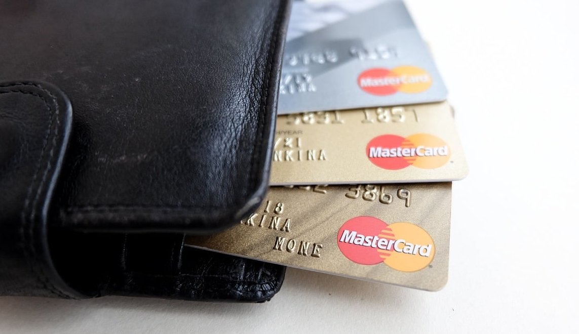
A paper punch card is still one of the cheapest and most effective retention tools a small business can buy. No app, no subscription, no login. Just a card in a wallet that quietly reminds your customer that they are five coffees away from a free one.
The problem is that most punch cards are designed badly. The stamp boxes are too small for a real rubber stamp, the card stock is too thin to survive a month in a back pocket, and the file gets sent to the printer in RGB with no bleed. This guide covers the practical side of loyalty punch card design: exact dimensions, how many slots to include, stamp spacing, paper weight, and the export settings that make the difference between a crisp card and a blurry one.
Standard Loyalty Punch Card Sizes
The golden rule: if it does not fit in a wallet, it gets thrown away. That is why the standard business card format dominates punch card printing. Below are the formats that actually work, with trim size and the full bleed size you need to set up in your design file.
| Format | Trim size (inches) | Trim size (mm) | Size with 3 mm bleed | Best for |
|---|---|---|---|---|
| US business card | 3.5 x 2 in | 88.9 x 50.8 mm | 94.9 x 56.8 mm | North America, 6 to 10 punches |
| EU / ISO business card | 3.35 x 2.17 in | 85 x 55 mm | 91 x 61 mm | Europe, credit card wallet slots |
| Credit card format (rounded) | 3.37 x 2.12 in | 85.6 x 53.98 mm | 91.6 x 59.98 mm | Plastic or laminated premium cards |
| Oversized / bookmark | 3.5 x 4 in | 88.9 x 101.6 mm | 94.9 x 107.6 mm | 12 to 20 punches, service menus |
| Folded card (closed size) | 3.5 x 2 in | 88.9 x 50.8 mm | Flat 7 x 2 in plus bleed | Four panels, terms and conditions |
Recommendation for most cafes, salons and barbershops: start with the standard business card size. It fits every wallet, it is the cheapest format at every printer, and it forces you to keep the design simple.
Portrait or landscape?
Landscape is easier to stamp because the card lies flat and the staff member can see all the boxes at once. Portrait looks more premium and gives you a natural vertical grid for 10 punches in two columns of five. If your counter is cramped, go landscape.

How Many Punch Slots Should You Include?
The number of slots is a business decision before it is a design decision. Too many and the reward feels unreachable. Too few and you give away margin without building a habit.
| Business type | Purchase frequency | Recommended punches | Typical reward |
|---|---|---|---|
| Coffee shop / bakery | Daily or weekly | 9 or 10 | 10th drink free |
| Barbershop | Every 3 to 5 weeks | 5 or 6 | 6th cut free or half price |
| Hair salon / beauty | Every 6 to 10 weeks | 4 or 5 | Free treatment or product |
| Lunch spot / food truck | 2 to 4 times a week | 8 to 12 | Free main dish |
| Car wash / pet grooming | Monthly | 5 to 7 | Free service |
The two free punches trick
If you print 10 boxes, stamp the first one or two at the moment you hand over the card. This is the endowed progress effect: a card that is already 20 percent complete gets finished far more often than an empty card with 8 boxes. Design for 10 slots, give away 2, and the customer still buys 8.
Stamp and Hole Punch Layout: Spacing That Actually Works
This is where most DIY cards fail. The designer draws elegant 6 mm circles, then the owner buys a 12 mm rubber stamp and every impression bleeds over three boxes.
Match the box to the tool
- Rubber stamp: measure your stamp face first. Common self inking stamps are 10 mm, 12 mm or 15 mm in diameter. Your box should be the stamp diameter plus 2 to 3 mm of breathing room.
- Hole punch: standard handheld punches cut 3 mm to 6 mm holes. Leave at least 4 mm between the hole center and the card edge so the paper does not tear away.
- Pen or marker: the most forgiving option. Boxes of 7 to 9 mm are enough for a tick or an initial.
Practical spacing numbers
- Gap between boxes: 3 to 4 mm minimum. Below 3 mm the stamps overlap and the card looks messy after four visits.
- Distance from trim edge: keep every box at least 5 mm from the cut line. Commercial cutting tolerance is typically 1 to 2 mm, and a box that touches the edge will look misaligned on half the batch.
- Stroke weight: 0.5 pt to 1 pt outlines. Hairlines under 0.25 pt can disappear on uncoated stock.
- Numbering: if you number the boxes 1 to 10, use 6 to 7 pt type placed outside or under the box, never inside where the stamp will cover it.
Sample grid for a 3.5 x 2 in card with 10 punches
On an 88.9 x 50.8 mm card, reserve the bottom 28 mm for the punch grid and the top 22 mm for the logo and offer line. Two rows of five boxes, each box 11 mm wide, with 3.5 mm gaps, gives a total grid width of 69 mm. Center it and you have exactly 10 mm of margin on each side. Clean, safe, and stampable.
Alternative layouts worth testing
- Single row of 6: ideal for barbershops, very readable, large boxes.
- Icon boxes: replace plain circles with outlined coffee cups, scissors or paw prints. Keep the interior area open so the stamp still reads.
- Final box highlighted: make slot number 10 a different color or add the word FREE inside it. It is a visual finish line.

Card Stock Weight and Finish Recommendations
A punch card lives in a wallet for weeks or months. Standard flyer paper will be pulp by visit three. Here is what to order.
| Stock weight | GSM equivalent | Durability | Verdict |
|---|---|---|---|
| 65 lb cover | 176 gsm | Low | Only for short campaigns of 2 to 3 visits |
| 80 lb cover | 216 gsm | Acceptable | Budget option, fine for pen marking |
| 100 lb cover | 270 gsm | Good | Sweet spot for most punch cards |
| 14 pt | about 300 gsm | Very good | Standard commercial business card stock |
| 16 pt | about 350 gsm | Excellent | Best balance of feel and punchability |
| 18 to 32 pt | 400 gsm and up | Premium | Luxury feel, but hard to hole punch by hand |
Finish: this matters more than weight
- Uncoated or matte: the only safe choice if you use ink stamps or pens. Ink absorbs and dries instantly.
- Gloss or UV coated: looks great, but stamp ink smears and pen ink never dries. Avoid full gloss on the side you stamp.
- Spot UV or soft touch: acceptable if you apply it only to the front and leave the punch area uncoated.
- Laminated or plastic: only works with a hole punch, never with a stamp.
A smart hybrid: gloss on the front, uncoated on the back, with the punch grid on the uncoated side.
What Goes on Each Side of the Card
Front
- Your logo, clean and large enough to recognize at arm’s length
- The offer in one sentence: Buy 9 coffees, get the 10th free
- The punch grid, if the design allows
Back
- Address, phone, opening hours
- Website and one social handle (not four)
- A line for the customer name, which dramatically reduces card sharing
- Terms in 6 pt: one punch per visit, no cash value, expiry date if any
Typography and contrast
Body text at 8 to 10 pt and headline text at 12 to 16 pt. Terms can drop to 6 pt but no lower. Use high contrast between the punch boxes, the background and the text, because a stamp applied over a busy photo becomes invisible. Dark outlines on a light panel is the most reliable combination.
Bleed, Safe Zone and CMYK Export Settings
This section is the one that saves you from a reprint.
Document setup
- Color mode: CMYK from the very first click. Designing in RGB and converting at the end shifts bright blues and greens noticeably.
- Resolution: 300 DPI for the document and for every placed image. 150 DPI is visibly soft at this size.
- Bleed: 3 mm on all four sides (0.125 in in the US). Extend any background color or image to the bleed line, not just to the trim line.
- Safe zone: keep all text, logos and punch boxes at least 3 to 5 mm inside the trim line.
- Rich black: for large black areas use C40 M30 Y30 K100. For small text, use K100 only to avoid registration fuzz.
- Total ink coverage: stay under 300 percent so the ink dries properly on coated stock.
Export checklist
- Export as PDF/X-4 or PDF/X-1a, whichever your printer requests
- Include 3 mm bleed and crop marks with an offset of at least 3 mm
- Embed or outline all fonts
- Flatten transparency if your printer asks for PDF/X-1a
- Supply front and back as two pages in one file, same orientation
- Do not add a border frame around the edge unless you accept that it may look uneven after cutting
Free and low cost tools that handle bleed properly
- Adobe InDesign or Illustrator: full control, native bleed and CMYK
- Affinity Publisher or Designer: one time purchase, full print features
- Canva: workable, enable Show print bleed and export as PDF Print with crop marks and bleed. Check with your printer about CMYK conversion
- Inkscape: free, but you must set the bleed manually and convert color profiles yourself
Common Punch Card Design Mistakes
- Punch boxes too small for the actual stamp
- Glossy coating on the stamping side
- No name line, so one card serves a whole office
- No expiry or terms, which makes disputes awkward
- Background photo behind the grid, making stamps unreadable
- Design sent at 72 DPI straight from a web export
- Text or boxes sitting 1 mm from the trim line
- Forgetting a QR code linking to your booking page or menu
A Quick Production Workflow
- Decide the reward and the number of punches
- Buy or measure your stamp or punch tool
- Set up the document: trim size, 3 mm bleed, CMYK, 300 DPI
- Build the grid around the real stamp diameter
- Print one test sheet at 100 percent scale on plain paper
- Stamp all the boxes on the test print and check for overlap
- Adjust, export PDF/X with bleed and marks
- Order a small first run of 250 to 500 cards before committing to thousands
FAQ
What is the standard size for a loyalty punch card?
The standard is the business card format: 3.5 x 2 inches (88.9 x 50.8 mm) in North America and 85 x 55 mm in Europe. Both fit a wallet or a card slot, which is the main reason customers keep them.
How many punches should a loyalty card have?
Between 5 and 12 depending on how often customers visit. Cafes typically use 9 or 10, barbershops 5 or 6, salons 4 or 5. Aim for a reward that is reachable within roughly two months.
What card stock weight is best for punch cards?
14 pt to 16 pt (about 300 to 350 gsm), or 100 lb cover as a budget alternative. Choose an uncoated or matte finish on the side you stamp so the ink dries rather than smears.
How much bleed do I need for a punch card?
3 mm on every side (0.125 in). Any background color or image must extend into the bleed area, and all critical elements should stay at least 3 to 5 mm inside the trim line.
Should I design in RGB or CMYK?
CMYK, from the start. RGB files converted late in the process often lose vibrancy in blues, greens and oranges, which is especially noticeable on logos.
How big should the stamp boxes be?
Measure your stamp first, then add 2 to 3 mm. For a common 12 mm self inking stamp, use boxes of about 14 to 15 mm with 3 to 4 mm gaps between them.
Can I use a hole punch instead of a stamp?
Yes, and it works well on thicker stock. Keep each punch position at least 4 mm from the card edge so the paper does not tear, and avoid placing punch targets over text.
How do I stop customers from faking punches?
Use a custom shaped stamp or a decorative hole punch rather than a generic round one, add a name line, and number each card with a sequential code on the back.
Ready to Print?
A good punch card is not about fancy illustration. It is about a readable offer, boxes sized for your actual stamp, stock that survives a wallet, and a file exported correctly. Get those four right and you have a retention tool that costs a few cents per customer and keeps working for months. If you need help preparing a print ready file or choosing the right stock for your run, get in touch with our team and we will walk you through the specs.